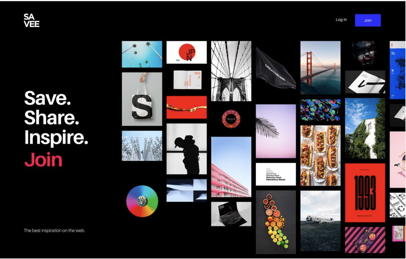
My favorite web design from “Design Trend: Vivid Rainbow Colors” is SAVEE. The bright clear colors with the black background really pops. Unlike some of the other sites with dark backgrounds it is crisp and clean and you are able to locate the call of action as soon as your eyes hit the page. I feel as though you need to be very careful in your planning and layout of this method so visitors eyes don’t get distracted and have to search to hard for call of action.
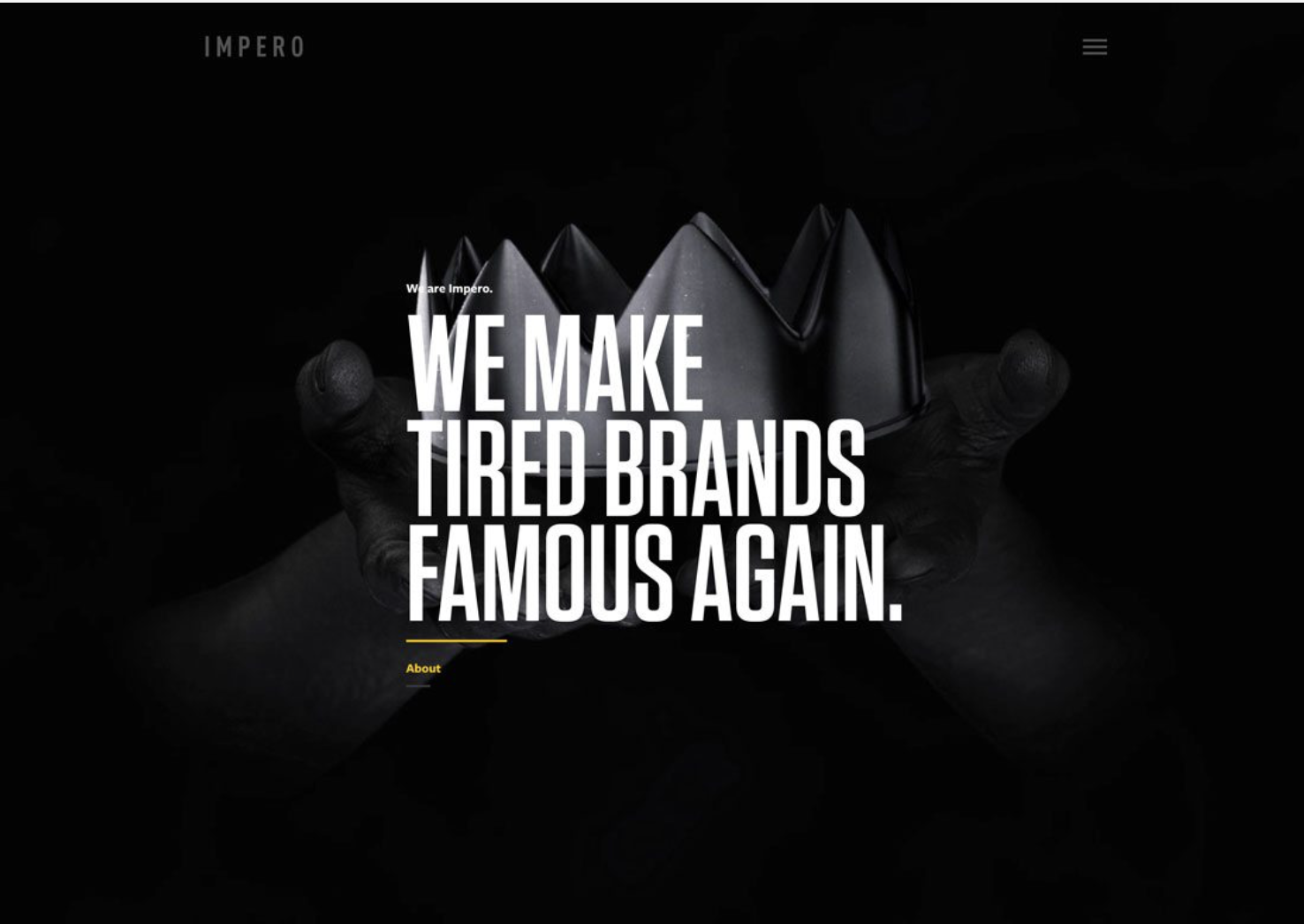
Initially the first website that caught my attention in “Design Trend: Dark Color Palettes & Animation” was Work Play. The account is expired so I was unable to see the animation aspect but I like the simplicity and easy view of call of action. My second favorite is Impero because it also has a clean crisp feel. The call of action is grey and against the black made it a little slower to find. The design is very simple and laid out nice so it is still recognizable pretty quickly.
After exploring different screen sizes with the websites that used vivid color I found that some of them became too busy. The website SAVEE stayed crisp and clean and my eye still easily found the call to action. Some of the others had my eyes wondering when the page had too much going on at a small scale. This was a problem with some of the darker color palettes also, FED EX was open of my least favorites. The call to action buttons were harder to locate when the color wasn’t white or too small.
The use of vivid color is inviting and makes you want to explore the site more when used correctly. It can be used to highlight important aspects of the website that the business wants you to focus on. It is also trendy and can make a website fun so people interact with it more. The use of dark palettes can be used to set a mood and also creates mystery. It is not a trend that works for everything but is great for things like movies, games, and music.
Vivid color and dark palettes are similar because when done correctly they are appealing to the eye and draw you into the site. When viewed at a larger scale both trends have a crisp bold feel and can be used to set either a fun mood with color or a mysterious mood with darks. They both have challenges when it comes to viewing them at a smaller size. It takes someone skilled in each trend to develop a successful appealing website.
